Showing posts with label iOS. Show all posts

Wednesday, June 10, 2015

Concept: Expiring Notifications

A clear all button in Notification Center is probably one of the most requested features for iOS. Apple added it on the Apple Watch using Force Touch but "clear all" has yet to make its way over to iOS. It would be very handy to be able to clear out all notifications with a single tap but I would also like to see Apple automate how notifications are handled. This concept will focus on that idea and can be split into two main parts: the first requires some tweaking in Settings and the second won't but will be targeted towards a specific category of apps.

Part 1: Recent Notifications
Let's start by analyzing the current (iOS 8.3) offering for controlling notifications. Some default Apple apps get special treatment and have more options while some have less but this is what the typical app will offer you: Do you want notifications from this app? If so, how many do you want to be displayed in Notification Center? Will these notifications make a sound, appear on your lock screen and so on.


What iOS offers for notification management works great except for the "Show in Notification Center" option. Show the 5 most recent notifications should automatically remove old items once the notification count exceeds the set limit, instead iOS stores all of those notifications and displays them once you delete one of the recent items. Personally, I don't get why anyone would want to see month-old notifications that were hidden.

The solution? A new setting that allows you to control how long iOS holds on to notifications sent from a certain app. For example in Mail, you can specify that you only want Notification Center to hold on to email notifications for today, and once tomorrow starts, clear all old Mail notifications from that day. Most people don't read and reply to their emails in Notification Center so it makes sense to have the most recent emails for that day only and maybe reserve a permanent spot for emails from contacts you've set as VIPs until they're read.


Part 2: Expiring Notifications
There's nothing more frustrating than receiving a notification from a store's app for a deal or a coupon that is valid throughout the weekend but once that weekend ends, the notification just remains in Notification Center until you manually clear it. The fix is quite a simple idea, if that notification had an expiry date and could just remove itself once it served its purpose then there wouldn't be any confusion and Notification Center wouldn't fill up with useless notifications. 

This works great for coupons but it works even better for live streaming apps like Twitch and especially Periscope, where live streams are usually very short. There have been countless times where I open Periscope through a notification to watch someone's live stream only to be presented with "this live stream has ended" because I was just a few minutes too late. Whereas if this notification was temporarily displayed for the duration of the live stream, then you're less likely to be disappointed and, no one wants a rapidly growing list of useless previous live stream notifications.

Other Ideas
Lastly, here are a few other things that could enhance the notifications experience that I came up with while writing this post. The first is a remind me later feature. It's an obvious feature that Apple already uses for OS X update notifications that prompt you to restart your computer to complete installation. These notifications usually have an "ask me later" menu with a few presets like in an hour or tomorrow. The second feature is also very obvious and already works seamlessly in the Messages app where a notification that is read on one of your devices is automatically removed from all of your other devices using iCloud. It would work perfectly for social media apps like Twitter and Instagram.
Monday, November 17, 2014

How To Improve Apple's Remote App

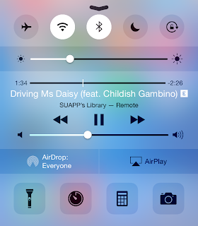
The other day, I was casually browsing Reddit and came across an intriguing post on the Apple subreddit. What if Apple designed a Today View widget for its Remote app.  My personal experience with the Remote app has been mixed. When it comes to controlling an Apple TV, I've taught myself to unlock my device, and find the Remote app (which I keep in a folder). Of course that also means either using your fingerprint for Touch ID or typing a passcode just to get in. As for the Remote app's second functionality, controlling an iTunes library, it hasn't been that easy. Usually on an Apple TV, the only reason you'd put down your device or close the app is because you've started a TV show or a movie. This means you likely won't need the Remote app for at least 20 minutes. However, it's different when it comes to music. A song will last around 3 minutes on average. Unless iTunes plays a song you're willing to listen to, you're most likely going to hit skip. That's a lot of opening and closing for an app just to do a simple task.

So, we have two fundamental problems: 1) there needs to be an easier way to control music; and 2) there has to be an easier way to access the virtual Apple TV remote.

Controlling Your iTunes Library
I can't recall how many times I've left the Remote app, reached a song I didn't like, and instinctively pulled up Control Center only to be disappointed with music controls for the iPhone music app. I can't imagine a situation where you would have your iPhone controlling music coming from a Mac and playing a different song at the same time. It's more likely that the music being played from your iTunes library is what you're listening to, and what you'd like to control. So, the solution? Grant Remote access to Control Center while connected to an iTunes library. Also, Apple can allow third-party remote apps like Sonos or Spotify to take advantage of this feature.


Controlling an Apple TV
One of the best features Apple added with iOS 8 has been Continuity and Suggested Apps. Continuity allows for seamless transition from one device to another whereas Suggested Apps uses your location to display relevant apps on the lock screen. Now, imagine you're in your living room watching something on your Apple TV. Your iPhone is aware of the Apple TV even if the Remote app is closed. You reach for your iPhone, unlock it, and swipe up on the Remote app shortcut that iOS has conveniently displayed on the lock screen. And just like that, you're already controlling your Apple TV, without having to unlock your iPhone and finding the Remote app.


Going back to the original topic of the Reddit thread I linked to above. A Remote widget is convenient however, I don't think it's likely to come true. First of all, it's inconsistent with the theme of Continuity and Handoff. Since a Remote app shortcut fits the Continuity theme of transitioning from an Apple TV to your iPhone/iPad, it makes more sense to place the shortcut at the same location you'd expect rather than the Today View in Notification Center. Another, minor issue is iOS widgets are placed under the Today View because they're meant to provide a summary of your day. I don't think Apple intended Today View for utility widgets as well. But, I still consider this argument minor because it's still the first version of iOS to allow widgets. Things could change in future releases. Also, keep in mind that Apple placed a Calculator widget in OS X Yosemite's Today View.

Sunday, October 26, 2014

Wallpapers 11: Bubbles

Concept credits: Fruit Animation by Kirill

Currently, the iPhone 6, iPhone 6 Plus, iPad Air, Macbook Pro with Retina Display 15", and iMac with Retina 5K Display are available for download at native resolution. These wallpapers should still work on lower resolution device i.e. iPhone 6 wallpaper will look fine on an iPhone 5S.


iPhone 6 & iPhone 6 Plus


iPad


MacBook Pro


iMac

Monday, October 13, 2014

Concept: Create Calendar Events With Natural Language & More Using Spotlight Search


With iOS 8 and OS X Yosemite, Apple made Spotlight Search smarter and more relevant by suggesting nearby places to eat, websites, apps from the App Store just to name a few. It's clear that Apple wants to make Spotlight Search the single place to start your searching on iOS and Mac. However, I think Spotlight Search still has much more potential, and it starts by breaking the restrictions of being a mere search engine. Google search, for example, is a search engine but, it can still show you local weather and solve simple mathematical calculations using dedicated widgets. I'm not suggesting Apple should develop it's own search engine but, continue to improve Spotlight Search with the goal of accomplishing more with less effort.

One of the features that usually distinguish third-party calendar apps from Apple's Calendar app is the ability to interpret natural language and create an event out of a simple sentence. Surprisingly, Apple already does this, on Mac only.


In fact, typing "apple special event on october 16 2014 from 1pm to 3pm" into the OS X Calendar app's Quick Event feature will produce exactly what you'd expect:


Of course, two obvious limitations to having Quick Event in Spotlight Search on iOS are Spotlight Search can't be accessed on the lock-screen nor within an app. However, in a situation where you just want to create an event quickly and avoid the menus of the Calendar app, being able to type into Spotlight Search can prove to be quite useful. Siri comes to mind as a solution to the problem however, you may feel uncomfortable speaking out-loud to your virtual assistant at some locations. It also happens that, creating Calendar events isn't the only feature Spotlight Search can borrow from Siri and — in some cases handle better.

The first is an obvious one, defining words. It's a strange omission. iOS already has a built-in dictionary so it can't be very difficult to start accepting "define" followed by a word in Spotlight Search. The same can be done for thesaurus and translating words. Typing a city or country name in Spotlight Search can bring up weather information. Also, by referencing Wolfram|Alpha, Spotlight Search can tap into a vast database allowing Spotlight Search to answer questions without a Google search (which I'm sure Apple would love) or perform complex mathematical calculations. For example, Spotlight Search can begin solving simple mathematical equations like 2 + 2 or the square root of 16 using the built-in Calculator app and then use Wolfram|Alpha for more complicated computations like solving for a variable or integrating a function. Again, Siri is already capable of doing that, but it makes less sense to use your voice when exponents and fractions are involved. Side note: typing "2 + 2 =" into Spotlight Search on the latest version of iOS will display a Wikipedia entry titled "2 + 2 = 5" as the top result. I though that was funny.


These are just a few starting points to improve Spotlight Search. It would be great if Spotlight Search opened up to third party developers too, but I wouldn't expect this to happen any time soon, considering Siri still can't interact with any apps or services unless predefined by Apple.

Friday, September 19, 2014

My Favorite Apps

Soon, millions of people will get their hands on the latest iPhone, and it may be the first iPhone for many. Apple surely knows that. So I thought this was the perfect opportunity to write a list of my favorite apps, in no particular order. This isn't going to be an ultimate guide for the best apps on the App Store, and it's not intended to be.

*App prices may change, I don't plan on updating prices during sales. Some apps offer in-app purchases for unlocking more features.*


Reminders & Lists

I love Clear. It's such a simple and straightforward app — so simple that Reminders were only added a few months ago, but that's the beauty of it. When it comes to productivity, I can't accomplish anything in a cluttered environment and believe me, it doesn't get any more 'clutter free' than Clear. It also syncs with Clear for Mac ($9.99).

Taking Notes

I like Simplenote (free). It's free, looks great and syncs with my Mac. As the name suggests, its also simple, a common theme in this list so far. Some people prefer Evernote (free) for taking notes but I find it overwhelming, especially when all I want to do is jot down a quick note on my iPhone.

Twitter

I use the official Twitter (free) app, nothing fancy here. I'm not a big fan of using clients but if you're looking for the best Twitter experience, the consensus among iPhone users seems to be Tweetbot ($4.99). I just wish the Twitter app synced my timeline with the Twitter app on my Mac, which by the way, Tweetbot does.

News & RSS

When it comes to news nothing beats Flipboard (free). I don't know what it is about Flipboard but ever since I started using it, it has been virtually impossible to use another news app on my iPhone — no matter how hard I try. After many attempts I've given up and just accepted that there's no alternative.

As for RSS, I've stuck with Reeder 2 ($4.99). There are a few alternative RSS readers out there like Unread ($4.99) but I'm happy with Reeder, not much to complain about.

Every iPhone also needs a read-it-later app. I prefer Instapaper (free) but Pocket (free) is just as awesome; you really can't go wrong with either service.

Music

Local music files are almost never stored on my iPhone, so instead I like to stream music. There are many options to choose from like Spotify (free), Rdio (free) etc. I use Spotify but all it really boils down to is preference and whether the service is available in your country. Having a Mac app is also a big deal for me.

I also absolutely love SoundCloud (free). As a big music enthusiast, SoundCloud is an incredible tool for discovering new music and following the artists you already love. I urge you to give SoundCloud a shot, I'm glad I did.

Podcasts

I've been enjoying Overcast (free) lately, but there are many great apps for listening to podcasts. In fact, here are a few that Overcast recommends if you don't like the app: Instacast (free), Castro ($3.99), Downcast ($2.99), and more. I even don't mind the default Podcasts app that comes pre-installed with iOS 8. (Some will strongly disagree with that last statement.)

Documents

I primarily use Dropbox (free) for storing documents and other important files just because I like to have those files accessible on literally every device I own. But, if you're not a big fan of cloud storage, Documents (free) is another excellent option that does a bit more and is probably the closest you'll ever get to a file system on an iPhone.

Games

I don't play much games on my iPhone, as I find other dedicated devices for gaming offer a better experience. But some of my favorites that I think every iOS device owner should at least try are: Groove Coaster Zero (free), Letterpress (free), QuizUp (free), and Threes! ($1.99). After all, you're getting the best app store for games! (And the best app store in general.)

More Cool Apps

IFTTT (free) is a common "cool app" for setting up recipes like automatically downloading Facebook photos that you were tagged in. I don't currently use it but definitely give it a try, there's quite a bit of combinations that you can try out.

Another cool app, that I actually do use is TalkTo (free) which lets you send messages to stores asking anything from closing times to whether an item is in-stock or not. Very convenient and it works. From my experience, replies usually take around 5-10 minutes but I've hit the 20 minute mark before.

EDIT: The TalkTo app has been discontinued, however the TalkTo service has moved to become part of Path Talk (free).

Wolfram|Alpha ($2.99). Wolfram|Alpha completes Google (that's how good it is), so if you don't already know what Wolfram|Alpha is please try it — the website is entirely free to use. You can technically bookmark the website and have access to everything but I just love Wolfram|Alpha so much that I justified paying for an app.


If there's a category that I didn't include then I either didn't consider it essential or I currently use a default app to get the job done (examples: for calendars I use Calendar and for web-browsing I use Safari). 

It's always funny to write posts like this and realize how many of my favorite apps are free, considering the sum of money I've spent on the App Store.

Wednesday, September 10, 2014

How-To Make Your Own 'Two-Toned' Wallpaper

On monday, I published 'Wallpapers 10: Two-Toned' featuring a new wallpaper design inspired by a Daft Punk poster. Readers were also able to submit requests (you still can submit requests) but many also requested a guide on how I went about editing the images and what software I used. So, here it is, how-to make your own 'Two-Toned' wallpaper.

Software

I use Adobe Photoshop CC for Mac.

Finding An Image

While low-resolution images are still usable to a certain extent, you're much better off using a high-resolution image for your wallpaper. While you are searching for an image, make use of Google Image Search Tools which allows you to specify the image size you'd like Google to display.

Edit

For this guide, I will be using a Steve Jobs image to demonstrate how to design a Two-Toned wallpaper (the original wallpaper is available for download at 'Wallpapers 10: Two-Toned'). Also, if at any point you get stuck or cannot find a specific feature, try searching for the feature using Help in the Mac Menu Bar.
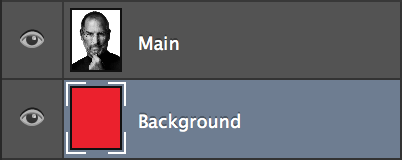
  1. Open a new document (Command-N) and paste your image. I usually like to start off by unlocking the Background layer by double clicking the Background layer and choosing "OK" however, this is not necessary.  Now that the document is all set up, you can start editing.

  2. If the Background layer is unlocked, select it to make it active. Otherwise, create a new layer (Shift-Command-N). Select the Paint Bucket Tool (G) and change the color to #ee1c24. Using the Paint Bucket Tool, fill the new layer. This will be the background; pick a different color if you desire. If the background layer is in front your main layer, drag it behind in the Layers panel. Despite no noticeable change taking effect, this step will help later on.


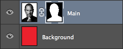
  3. Select the main layer containing the image and create a layer mask. A layer mask allows you to remove parts of an image by painting over them. Layer masks are preferred because they are non-destructive, meaning any part of the image can be recovered by erasing the painted area. The layer mask will be used to remove the background.


  4. Hold down the Magic Wand Tool to reveal the Quick Selection Tool (W). Select the Quick Selection Tool. Change the brush size to 5 pixels for precision and begin painting over the background. The Quick Selection Tool will begin selecting parts of the image that are similar. In this case, there is a clear contrast between the subject and the solid white background. This is not the case with complex backgrounds which will require you to trace around the outer edges of your subject. If you accidentally select part of the subject (which will happen), you can hold 'Option' to erase your selection.


  5. Once the entire image background is selected, make sure the layer mask is active. Switch to the Brush Tool (B), enlarge the brush size to 200 pixels and begin painting over the entire image. You will notice the selected area begin to disappear revealing the underlying layer that you created earlier. This is what a layer mask is useful for.


  6. If any parts of the background are left behind, repeat the steps above to remove them.

  7. With the mask layer active, head over to "Select" on you Mac Menu Bar and select "Refine Mask" (Option-Command-R). You can experiment with the different settings until the outer-edges are smooth. I usually keep the Radius within 0.5 - 1.0 pixels and adjust "Smooth" and "Shift Edge" accordingly.

  8. Next, right-click the Layer Mask thumbnail and select "Apply Layer Mask".

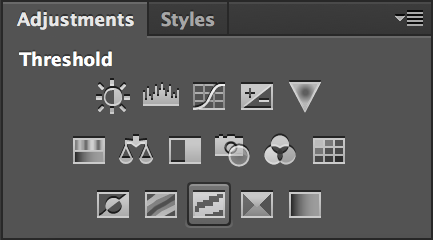
  9. Now for the magical step. Hide every layer except for the main layer by clicking the eye icon. Under 'Adjustments' select "Threshold". This will give your image the two-toned look. Adjust the threshold using the slider until you are satisfied with the results.


  10. Right-click on the new Threshold layer and select "Merge Down" (Command-E). Re-enable all layers by re-selecting the eye icon.

  11. Create another layer (Shift-Command-N) and place it in-between your main and background layer. Select the Paint Bucket Tool (G) and change the color to #efeaaa. Using the Paint Bucket Tool, fill the new layer. This will be the subject color. I will refer to this layer as "tone".

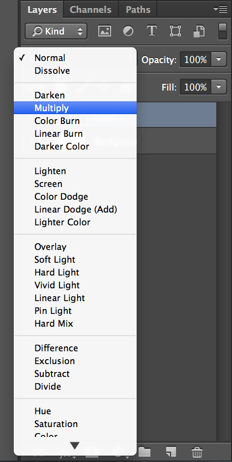
  12. Click the main image layer to make it active, select the drop-down menu above with "Normal" selected and change it to "Multiply". This is the blending mode which, in this case blends white to any color in the underlying layers.


  13. Switch the Quick Selection Tool back to the Magic Wand Tool (W) and adjust the tolerance to 90. Select the empty portion of the main layer, switch back to the "tone" layer you created two steps ago and then press "delete" on your keyboard.

  14. You may notice some of the color leaking outside the subject's outer-edge. This is caused by excessive Mask Refinement but can easily be fixed by using the Eraser Tool (E) to erase the extra color within the "tone" layer.
You can also choose to crop the image to fit your device's screen aspect ratio but, that's all there is to it. I hope that you respect my work as this post is intended for personal use only. If you choose to share your creations, all I ask is that you give me credit if this post helped you create Two-Toned wallpapers. A simple "Design by SUAPP" and providing a link to this blog is all I require.

Thursday, September 4, 2014

iPhone 6 Will Include "One-Handed Mode"

To deal with concerns that a bigger phone will make typing with one hand difficult (the current iPhone has a 4-inch screen), some changes to the design of the iPhones’ software interface will allow people to type or use apps with just one hand — there will be a one-handed mode that can be switched on and off, two employees said.
I guess that's how Apple will justify the increase in screen size on the next iPhone(s), after being opposed to larger screens for years due to the argument that single-handed use wasn't worth sacrificing in favor of a bigger screen on a phone.

Tuesday, September 2, 2014

Wow, It's An Official Reddit App

That's right, there's an official Reddit app, finally. Too bad it's only for AMA's (Ask Me Anything) but I'll take it.

Tuesday, August 26, 2014

Instagram Launches Hyperlapse

Today, Instagram released Hyperlapse, an app for shooting smooth time-lapse videos — not to be confused with Microsoft's Hyperlapse from two weeks ago which also dealt with stabilizing time-lapse videos. Instagram's Hyperlapse does however appear to be a bit more complex than the time-lapse feature Apple added to the Camera app in iOS 8.

From Wired, on the inspiration behind Hyperlapse and how it reached Instagram:
Inspired by a demo in which he saw gyroscopes attached to cameras to de-blur their images, Karpenko had an aha moment: Smartphones didn’t have nearly enough power to replicate video-editing software, but they did have built-in gyroscopes. On a smartphone, instead of using power-hungry algorithms to model the camera’s movement, he could measure it directly. And he could funnel those measurements through a simpler algorithm that could map one frame to the next, giving the illusion that the camera was being held steady. He mocked up a simple demo, and filmed a dot on his wall, while making his hand shake. “The images in the test matched up almost exactly, and that’s when I knew this was doable,” Karpenko says.

Eventually the duo uploaded video of the app in action to Instagram’s internal message board, where it received the ultimate blessing: a single comment from Instagram co-founder and CEO, Kevin Systrom. It simply declared, “This is cool.” This, in turn, egged them on to present their project to the wider group, at the company’s first “pitch-a-thon” for new creative tools, held last January. (Many of Instagram’s new features are the result of that meeting, including the sliders that allow you to dial in the strength of each filter.)
The technology certainly seems impressive. I'm excited to try the app out and might even upload one of my attempts, if it's worth sharing.

Download Hyperlapse

Monday, August 25, 2014

Tydlig is Free for Apple Store App Users

What might possibly be the best iOS calculator app, Tydlig, is now free if you have the Apple Store app installed on your device. Tydlig is being touted as a "work hard" app for students going back to school this fall. The offer will run until September 12 and then will be updated to feature the next app. According to Apple:
This month we're celebrating four themes that represent the life of a college student: Get going. Head out. Work hard. Wind down.

This week, work hard with Tydlig, a calculator reimagined to help you with everything from tips and discounts to real-time graphing. Work smarter, not harder, by referencing your previous calculations, and share your work by printing or exporting results as a high-quality PDF. 

Wednesday, August 20, 2014

Looking Back At How Apple's Stock Dropped from Its All-Time High & Its Recovery

As I write this post, Apple Inc. stock has closed at $100.57 which beats Apple's previous record of $100.30 (after the 7-to-1 stock split). The previous all-time high was back in 2012 at a similar time to now — ahead of a major fall announcement.


2012: Apple & the iPhone 5


After months of anticipation for what Apple will release and what the next iPhone will do and look like, the iPhone 5 was announced and it wasn't the massive hit everyone had hoped it would be. The initial iPhone 5 sales were considered disappointing and labeled "worst case scenario" at 50 million. Disappointing sales were blamed on supply chain issues and declining demand. There were concerns that competition from Google and Samsung might finally be catching up and putting pressure on Apple and its ability to innovate. Also, the iPhone 5 wasn't considered to be impressive enough and had a 'purple hue' camera issue. All of that was coupled with Apple's major failed launch of its subpar in-house Mapping solution replacing Google Maps and a release of iOS that didn't feature the redesign everyone was looking forward to, which of course, came a year later with iOS 7. Doubts about Apple's ability to innovate and failures like the Maps app translated into doubts about Tim Cook's leadership. People wanted more from Cook and an iPad mini lacking a Retina Display just didn't cut it. There were many shake-ups to Apple as a whole as well, most notably was Scott Forstall leaving Apple after being a part of the company since its early days — joining NeXT in 1992, before NeXT was purchased by Apple in 1997 and, before Apple became the company it is today.

To sum it up: 2012 wasn't a great year for Apple; it was a transitional stage and took a whole two years just to recover from.


2014: What Has Changed?


Starting with the iPhone, the iPhone 6 is expected to come in two sizes, a 4.7" and 5.5" version, despite the way Apple would go about differentiating the two devices remaining a mystery. Reports claim that Apple has ordered 70-80 million 4.7" and 5.5" iPhone 6's. As for software, iOS 8 looks promising with extensions, third-party keyboard support and an even deeper integration with OS X. Also, Apple's iPhone business is being praised. After years of claims that Apple will fail if they don't go after the emerging market, analysts are finally starting to realize that maybe Apple knew what they were doing all along. By not joining every other manufacturer to a race to the bottom, especially following Samsung's disappointing earnings report, Apple can continue to maintain it's lead and remain relevant by focusing on differentiating itself with iOS and maintaining its premium status. We also have a new product category right around the corner, which of course is the iWatch, iTime or whatever name it receives. Despite a report from KGI Securities analyst Ming-Chi Kuo claiming the iWatch will be delayed until 2015 due to manufacturing problems, I still firmly believe that we will hear about a device that you can wear on your wrist within the upcoming months leading up to the holiday season.

All in all, if Apple wants to maintain it's stock price: deliver an iWatch, both versions of the iPhone 6, avoid a Maps-scale failure and throw in the usual iPad upgrades — basically, live up to Eddy Cue's claim that Apple's 2014 launch line-up is the most exciting in 25 years.

Sunday, August 17, 2014

Apple Wins Emmy Award for 'Misunderstood' Holiday Ad

A well deserved win. If you want to see all the nominees for the 2014 Outstanding Commercial Emmy including GE and Nike, head over to 9to5Mac.

Tuesday, August 12, 2014

Apple Maps Dominate In U.K.

According to a new report from EE, one of the largest mobile network operators in the U.K.:
Traffic on the new Apple Maps now represents 70% of mapping traffic on the 4G network, from 60% in the second half of 2013, taking market share from Google maps, which is down 7ppts. This difference is even more marked over 3G where Apple Maps is up 19ppts and Google Maps is down 15ppts.
The reality is Apple Maps don't suck anymore. Apple has worked hard behind the scenes to flush out their mapping service to be the finished product they should've shipped back in 2012. From my experience, Apple Maps and Google Maps are pretty much on par so, what it really comes down to for me is deeper iOS integration vs. transit directions, and in most cases (including this one) a deeper integration trumps any feature that a third party app wants to offer. Plus, we already know transit directions within Apple Maps are imminent so it's just a matter of time.

iOS 8 Changes Impacting Retail Tracking Startup Nomi

Nomi had to lay off a third of its employees due to privacy changes in iOS 8 which will randomize the MAC address broadcasted by iPhones while searching for a Wi-Fi network. According to Re/code:
Nomi sold a service to retail stores that allows them to track how many shoppers visit their stores, where they spend time inside the stores and how frequently they return. [...] repeat visitor information was mainly gathered by keeping track of an iPhone’s MAC address — the 12-character identifier that is broadcast when a phone is searching for nearby Wi-Fi networks.
Apple basically wants retailers to use its own technology, iBeacons for retail tracking. Nomi CEO Marc Ferrentino said in an interview that "Apple is signalling to the market that beacons are the way that they want this to be done."

'Why Surveillance Companies Hate the iPhone'

Craig Timberg reporting for The Washington Post:
The secrets of one of the world’s most prominent surveillance companies, Gamma Group, spilled onto the Internet last week, courtesy of an anonymous leaker who appears to have gained access to sensitive corporate documents. And while they provide illuminating details about the capabilities of Gamma’s many spy tools, perhaps the most surprising revelation is about something the company is unable to do: It can’t hack into your typical iPhone.
Part of the leaked 'sensitive corporate documents' include this chart which shows that unless iOS is Jailbroken, Gamma Group's spy tools are unable to hack into an iPhone.

 Source: Cult of Mac

Wednesday, August 6, 2014

Foursquare 8.0

Foursquare just launched their app redesign that focuses on location-based recommendations. Foursquare's move to splitting Foursquare and moving check-ins to their new app Swarm has angered many long time users. I, on the other hand, am part of a minority that is excited to try out the new Foursquare app. I rarely used Foursquare in the past for it's main functionality — checking-in, so the app split doesn't bother me. I've yet to find a favorite app in the 'find new things to do/places to eat around me' category and the new Foursquare app has a good chance of occupying that spot on my iPhone, with its vast database of user check-ins and tips.

Saturday, August 2, 2014

“How To Alienate Your Users And Make Them To Leave Your Successful App”

A 5 step guide on how to alienate your users, by Aleyda Solis:
  1. Split your app in two and force users to download your new app in order to have the same functionality they usually enjoyed before with just one, easy to use app. You will have clear arguments: You need to grow and diversify, your functionalities need to evolve and you need to monetize them in different ways, so it would be very complex to keep them all in just one app.
An entertaining post about Foursquare's new strategy of splitting their popular app — Foursquare, into 2. But, this isn't about Foursquare. I never was a big Foursquare user so if anything, I'm excited to try their new app. My frustration is with Facebook. To me, the first point perfectly sums up how I feel about Facebook forcing you to download the Messenger app by removing messaging functionality from the Facebook app. The Messenger app is great and might I add, looks much better than the original Facebook app. But, that doesn't justify forcing a transition especially when users like me just want to send a message and aren't interested in Facebook's take on group messaging, wi-fi calling, voice messages, stickers etc.

As for "clear arguments", here's Facebook's: "Messenger is much faster. You'll get new messages instantly and can reply right away." Great. Perfect for anyone browsing their Facebook feed and receiving a message from a Facebook friend. They'll be on their way to "reply right away" after leaving Facebook and being thrown into the fast Messenger app.

And so with that said, I'd like to add a new step to alienate your users.
  1. Leave a shortcut button in your main app to the relocated service because it is fundamental to your main app's functionality. But, users will have to be thrown from app to app just to accomplish a simple task that they once could easily do in the main app.
Once everyone has transitioned into Messenger, maybe Facebook should release an app that lets you write posts because you know, speed and what not. I'll be looking forward to it along with every other frustrated user that gave Messenger a 1 out of 5 rating on the AppStore.

Thursday, July 31, 2014

Wallpapers 9: Paint Splatter

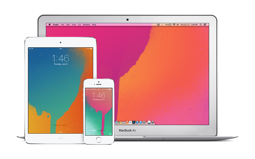
Got a sudden inspiration to create wallpapers from the recent iTunes Gift Cards design. I know it's late but hey, I like them. Also for the first time, all wallpapers are available for iPhone, iPad and Mac.


iPhone

Blue on Orange for iPhonePink on Green for iPhonePink on Orange for iPhonePurple on Blue for iPhone


iPad

Blue on Orange for iPadPink on Green for iPadPink on Orange for iPadPurple on Blue for iPad


Mac

Blue on Orange for MacPink on Green for MacPink on Orange for MacPurple on Blue for Mac

Friday, July 25, 2014

The Best Example of Bad Design by Apple

Let's say for whatever reason, you decide to turn on Airplane Mode on your iPhone — maybe you're running low on battery or you're travelling out of country. Anyways, your iPhone is now disconnected and you decide to open an app that requires some form of connectivity to function. Let's take a simple example, Safari. You try to load up a website and then you're prompted with a dialogue box that says "Turn off Airplane Mode or Use Wi-Fi to Access Data" and your options are "OK" and "Settings". "OK" will dismiss the dialogue box and "Settings" will throw you into the settings app so you can turn off Airplane Mode or turn wi-fi on.

There are two problems here:

1) The settings button is fine, it does exactly what it's meant to do but, the problem lies with OK. To a normal person, OK would indicate giving permission — OK, turn off Airplane Mode so I can view this content, not OK, dismiss what you just told me and leave me having to do all the work myself. Somehow, OK needs to become something more obvious like cancel either by rewording the prompt or following the suggestion I'm going to make next...

2) The approach is all wrong, it feels like the type of approach Apple would take before iOS 7; before Control Center which is supposed to limit the number of times you visit settings for simple tasks like turning wi-fi on and off. So why are we still being yanked out of an app to do a simple task? At the very least, bring up Control Center as opposed to the settings app but, we can still do even better than that.

Instead of being confined to the basic utility of buttons, switches can be incorporated to simplify the process of turning certain settings on and off. Users are already familiar with switches and will definitely understand the meaning of Cancel. This approach is a rough idea I came up with and it may have some flaws. For example, it wouldn't make sense to just use Cancel as that will indicate no changes are applied so perhaps the inclusion of a "Done" button that only becomes clickable if changes are made would be more appropriate.


If you feel that complaining about something so simple is a bit of a stretch, try it for yourself. To this day, I still make the mistake of hitting OK accidentally, otherwise I wouldn't be writing about this issue here. Also, this isn't the only example of dialogue boxes with vague options and a tedious implementation for the user. Another example will result from having wi-fi turned off while using the Maps app. In the end, what it comes down to is detail. The smallest details are what add up to an outstanding experience and this, in my opinion is one detail Apple should take some time to address.

Tuesday, July 15, 2014

Apple & IBM Partner Up

Apple and IBM just announced a massive partnership that can give Apple a major advantage in the business market. The new partnership will entail IBM creating more than 100 apps that tap into IBM's services including device management, security, analytics and mobile integration exclusively for iPhones and iPads and selling them to their clients worldwide. In return, Apple will provide 24/7 AppleCare support for IBM's enterprise customers. Ultimately, IBM currently doesn't have a strong mobile presence in enterprise, so teaming up with Apple provides a major incentive for customers to choose iOS and IBM.

The partnership will also put pressure on Microsoft who has been making a serious push into cloud and mobile services for enterprise and previous industry leader, BlackBerry whom has been fighting to regain its title after years of declining profits.

UPDATE: Apple Press Info
UA-42274431-1