Thursday, July 31, 2014

Wallpapers 9: Paint Splatter

Got a sudden inspiration to create wallpapers from the recent iTunes Gift Cards design. I know it's late but hey, I like them. Also for the first time, all wallpapers are available for iPhone, iPad and Mac.
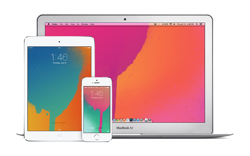

iPhone

Blue on Orange for iPhonePink on Green for iPhonePink on Orange for iPhonePurple on Blue for iPhone


iPad

Blue on Orange for iPadPink on Green for iPadPink on Orange for iPadPurple on Blue for iPad


Mac

Blue on Orange for MacPink on Green for MacPink on Orange for MacPurple on Blue for Mac

Shazam Comes to Mac

I don't think Shazam needs an introduction but, if you still don't know what it is; it's a service that identifies music and some TV shows just by listening. It's quite fascinating the first time you see it in action — especially popular songs that the algorithm can figure out just by hearing 2 seconds of the intro.

As a mobile only service for many years, getting Shazam on a Mac is exciting news. The Mac app just sits in the menu bar listening and identifying any music it hears. The always on feature was introduced to mobile a while ago but I never really enabled it for obvious battery life concerns. Now that it's on Mac, I'm willing to give 'always on' a try. Interestingly, there doesn't appear to be a simple 'Shazam-ing' button — it's either always on or always off.

There isn't much to point out here but, syncing with other devices would be great. Shazam has always served a secondary purpose for me besides the whole identification aspect. As someone who loves music, Shazam was sort of a to-do list for songs I wanted to listen to, so not having access to my iPhone tags on my Mac is huge.

Get Shazam for Mac

Wednesday, July 30, 2014

The iTime is Already a Failure

According to John C. Dvorak "The Apple iTime Is Destined to Fail". This is coming from the man that predicted the iPhone was destined to be a failure back in 2007. Also, can we take a moment to realize where Apple would be if it was taking advice from someone that thinks "a flip-open design to double the screen real estate" would be a good idea.

Tuesday, July 29, 2014

MacBook Pro with Retina Display Receives an Update

Apple gave the MacBook Pro with Retina Display line-up an update this morning. The update includes a boost in processing power, minor price cuts and most notably, double the RAM on both entry-level configurations.

The best part about today's spec upgrade is that it happened during Apple's annual back to school promotion. Students looking to purchase a MacBook for school can take advantage of the promotion and not have to worry that a better machine will be announced in less than three months.

Read Apple's Press Release

Hilton to Replace Keys with Smartphones

The Verge: 
The company [Hilton] plans to let customers use their smartphones to unlock room doors at most Hilton-owned hotels by the end of 2016.
I can't recall how many times I've stood in front of a hotel room's door and hoped I could just pull out my iPhone and unlock the door with a tap. Of course, the same applies for every situation I'm forced to pull out a wallet but, it's a start.

Another part of Hilton's initiative will allow customers to book and preview rooms using their smartphones, thereby bypassing the need to visit the front desk.

Friday, July 25, 2014

The Best Example of Bad Design by Apple

Let's say for whatever reason, you decide to turn on Airplane Mode on your iPhone — maybe you're running low on battery or you're travelling out of country. Anyways, your iPhone is now disconnected and you decide to open an app that requires some form of connectivity to function. Let's take a simple example, Safari. You try to load up a website and then you're prompted with a dialogue box that says "Turn off Airplane Mode or Use Wi-Fi to Access Data" and your options are "OK" and "Settings". "OK" will dismiss the dialogue box and "Settings" will throw you into the settings app so you can turn off Airplane Mode or turn wi-fi on.

There are two problems here:

1) The settings button is fine, it does exactly what it's meant to do but, the problem lies with OK. To a normal person, OK would indicate giving permission — OK, turn off Airplane Mode so I can view this content, not OK, dismiss what you just told me and leave me having to do all the work myself. Somehow, OK needs to become something more obvious like cancel either by rewording the prompt or following the suggestion I'm going to make next...

2) The approach is all wrong, it feels like the type of approach Apple would take before iOS 7; before Control Center which is supposed to limit the number of times you visit settings for simple tasks like turning wi-fi on and off. So why are we still being yanked out of an app to do a simple task? At the very least, bring up Control Center as opposed to the settings app but, we can still do even better than that.

Instead of being confined to the basic utility of buttons, switches can be incorporated to simplify the process of turning certain settings on and off. Users are already familiar with switches and will definitely understand the meaning of Cancel. This approach is a rough idea I came up with and it may have some flaws. For example, it wouldn't make sense to just use Cancel as that will indicate no changes are applied so perhaps the inclusion of a "Done" button that only becomes clickable if changes are made would be more appropriate.


If you feel that complaining about something so simple is a bit of a stretch, try it for yourself. To this day, I still make the mistake of hitting OK accidentally, otherwise I wouldn't be writing about this issue here. Also, this isn't the only example of dialogue boxes with vague options and a tedious implementation for the user. Another example will result from having wi-fi turned off while using the Maps app. In the end, what it comes down to is detail. The smallest details are what add up to an outstanding experience and this, in my opinion is one detail Apple should take some time to address.

Wednesday, July 23, 2014

Apple's Q3 2014 Results

Apple said it sold 4.41 million Mac computers in the quarter ended June 28, an increase of 17.6% from the same period a year earlier. It also marked the third straight quarter that Mac sales rose on a year-on-year basis, bouncing back after Mac sales fell 10% in the past fiscal year to September.

Sales of iPads are going in the other direction, with the number of units sold falling 9.2% after a 16% drop three months earlier.

Further highlighting the trend, the gap in revenue between the two products is fast closing. Apple sold $5.44 billion worth of Macs in the quarter, compared with $5.9 billion in iPads. The last time Mac revenue topped iPad’s was in 2011 when the tablet was still in its early days.
The more interesting bit of news to come out of Apple's financial results announcement yesterday.

Tuesday, July 22, 2014

New MacBook Air Ad

One of my favorite Apple advertisements to date. Makes you want to grab the nearest pair of Beats just to listen to it.


UPDATE: The song by Hudson Mohawke "Chimes" is now on SoundCloud and iTunes.

Saturday, July 19, 2014

Video Proves iPhone 6 Sapphire Glass Isn't Perfect

Video

The main takeaway is that the front panel Apple will supposedly use for the iPhone 6 isn't indestructible. Neither sapphire glass used in the panel nor Gorilla Glass can withstand being rubbed with sandpaper but, sapphire is more resistant to scratching - as it should be. Since sapphire is higher than sandpaper on Mohs Scale, it shouldn't have been scratched, meaning the new iPhone probably won't use pure sapphire but a mixture containing sapphire. A mixture of materials will also alow the panel to be more flexible.

As for the "not indestructible" part, you'll just have to watch the video and see for yourself.

Tuesday, July 15, 2014

Apple & IBM Partner Up

Apple and IBM just announced a massive partnership that can give Apple a major advantage in the business market. The new partnership will entail IBM creating more than 100 apps that tap into IBM's services including device management, security, analytics and mobile integration exclusively for iPhones and iPads and selling them to their clients worldwide. In return, Apple will provide 24/7 AppleCare support for IBM's enterprise customers. Ultimately, IBM currently doesn't have a strong mobile presence in enterprise, so teaming up with Apple provides a major incentive for customers to choose iOS and IBM.

The partnership will also put pressure on Microsoft who has been making a serious push into cloud and mobile services for enterprise and previous industry leader, BlackBerry whom has been fighting to regain its title after years of declining profits.

UPDATE: Apple Press Info

Sunday, July 13, 2014

How to Take Photos with Real Bokeh Using an iPhone

First off, what is Bokeh? To simply put it, Bokeh is just a term used to describe a photo with a blurred background. In fact, the literal meaning of Bokeh in Japanese is "blur". You've probably seen Bokeh used in Christmas photography, where Christmas lights in the background are blurred to appear as colorful orbs. You can actually see this exact effect used in one of the photos for our earlier posts for the release of 12 Days of Gifts.

Bokeh is controlled by three factors: 1) the aperture (the size of the opening in a lens to let light in); 2) focal length; and 3) distance. Without getting too technical, you will want to use these three factors to achieve a shallow depth of field which refers to the area that is in focus.


Let's start by observing what happens if you shoot an image with a wide aperture like f1.4. In this situation, the main subject is the sphere. Focusing on the sphere sets the focal distance but, since a wide aperture has a very shallow depth of field, neither the pyramid nor the cube will be included and therefore appear blurred.


This time, by maintaining the focal distance and reducing the size of the aperture to f5.6, we notice the depth of field widens. Widening the depth of field results in all three objects being included, meaning they all appear in focus once the photo is taken.

However, this is not necessarily how an iPhone works. Generally current smartphones ship with a fixed aperture.


In this situation we have opted for a new subject and a background. Since an iPhone has a locked aperture, we don't have the freedom of controlling the depth of field. In this example our subject is the cube so as usual, tap to focus to set the focal distance. However, notice how the background is now also included inside the depth of field and will appear in focus if we take a picture. So how do we overcome this? It's actually quite simple.


First of all, we want to try limiting the focal distance as much as we can. This means bringing the subject as close to the camera as possible before your iPhone can't focus on it anymore. Of course this will also depend on how large your subject is, but try to stay close. Because the aperture is locked, the depth of field remains relatively similar. So to blur the background, all you have to do is push it back as far as possible and that is where the third condition - distance, comes into play.

Here is a photo that I took a while ago with an iPhone 5 applying the same concepts mentioned above. This photo is straight from the iPhone's camera with no post-processing.


Keep in mind that you won't be getting the same level of Bokeh that you can expect from a DSLR and more professional equipment. Also, there are many apps that replicate the Bokeh effect using software and they can easily be used in conjunction with this hardware solution. But overall what it comes down to is not just knowing but rather understanding. Once the concepts are set then all that's left is to try and experiment for yourself.

Thursday, July 10, 2014

YouTube Creator Studio, AdWords Express & Sonos + SoundCloud

YouTube users will now be able to manage and monitor their channels using the new YouTube Creator Studio app. The app joins YouTube Capture as a mobile solution for YouTube content creators by offering the ability to edit video details and settings, use analytics to monitor video performance and receive push notifications. Google also released AdWords Express today for advertisers to edit and see detailed statistics on their ads. Blogger users may have also noticed the addition of a new AdWords tab.

Finally, by far the most exciting news today comes from the addition of SoundCloud as one of the services Sonos speakers will be able to tap into. Although it is still in beta, users can start enjoying music from SoundCloud beginning today. SoundCloud joins a list of partners including Pandora, iHeart Radio, Google Play Music, Songza, Rdio and more.
By bringing SoundCloud’s ever-expanding library of new and established publishers on to Sonos, you can easily discover music and audio that is not available anywhere else and with Universal Search on the new Sonos controller app, stumble upon music from your favorite artists on SoundCloud that you never knew existed.
Read the rest of the official Sonos blog post here.

Wednesday, July 9, 2014

Spotify Is Finally Coming to Canada

But before you get too excited, Spotify in Canada may take a little while. At the moment Spotify has only granted access to a select few that signed up through Spotify's Canada page or the Spotify app which is currently unavailable. 

According to Spotify:
While the Spotify app is now available in the iOS and Android stores we have not officially launched in Canada. Right now users can download the app and sign up for a waiting list on Spotify.ca. 
We know there is a lot of excitement and demand for Spotify in Canada and we want to reward those fans who have patiently waited for the launch, so we will begin sending out invitations to users who have signed up on the online waiting list shortly. Over the coming months we will be gradually inviting users on to the service in an attempt to systematically scale Spotify in the most manageable way possible. 
When Spotify launches in a specific country we always make sure that the experience is curated for local tastes and culture. That means great local content and local curation of the music discovery experience. Spotify in Canada needs to be much more than just the Canadian version of Spotify in the US. That is why we are taking our time to make sure that the service we launch in Canada is the best possible experience for music fans from B.C. to Nunavut to Newfoundland.
If you want to enter the queue for the pre-launch invite, you can sign up on Spotify's page or wait for the Spotify app to return to the App Store.

UPDATE: The Spotify app seems to be back and available for download.
UA-42274431-1