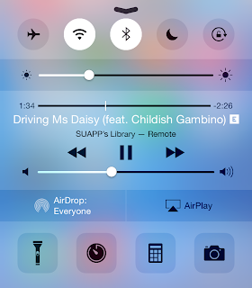
So, we have two fundamental problems: 1) there needs to be an easier way to control music; and 2) there has to be an easier way to access the virtual Apple TV remote.
Controlling Your iTunes Library
I can't recall how many times I've left the Remote app, reached a song I didn't like, and instinctively pulled up Control Center only to be disappointed with music controls for the iPhone music app. I can't imagine a situation where you would have your iPhone controlling music coming from a Mac and playing a different song at the same time. It's more likely that the music being played from your iTunes library is what you're listening to, and what you'd like to control. So, the solution? Grant Remote access to Control Center while connected to an iTunes library. Also, Apple can allow third-party remote apps like Sonos or Spotify to take advantage of this feature.

Controlling an Apple TV
One of the best features Apple added with iOS 8 has been Continuity and Suggested Apps. Continuity allows for seamless transition from one device to another whereas Suggested Apps uses your location to display relevant apps on the lock screen. Now, imagine you're in your living room watching something on your Apple TV. Your iPhone is aware of the Apple TV even if the Remote app is closed. You reach for your iPhone, unlock it, and swipe up on the Remote app shortcut that iOS has conveniently displayed on the lock screen. And just like that, you're already controlling your Apple TV, without having to unlock your iPhone and finding the Remote app.
Going back to the original topic of the Reddit thread I linked to above. A Remote widget is convenient however, I don't think it's likely to come true. First of all, it's inconsistent with the theme of Continuity and Handoff. Since a Remote app shortcut fits the Continuity theme of transitioning from an Apple TV to your iPhone/iPad, it makes more sense to place the shortcut at the same location you'd expect rather than the Today View in Notification Center. Another, minor issue is iOS widgets are placed under the Today View because they're meant to provide a summary of your day. I don't think Apple intended Today View for utility widgets as well. But, I still consider this argument minor because it's still the first version of iOS to allow widgets. Things could change in future releases. Also, keep in mind that Apple placed a Calculator widget in OS X Yosemite's Today View.